Case study · Design house
Lumé Skincare
Built for Athens, where temple-marble calm meets a deep oxblood glow. Logo, identity, and packaging, designed end to end by Muhammad Saad.
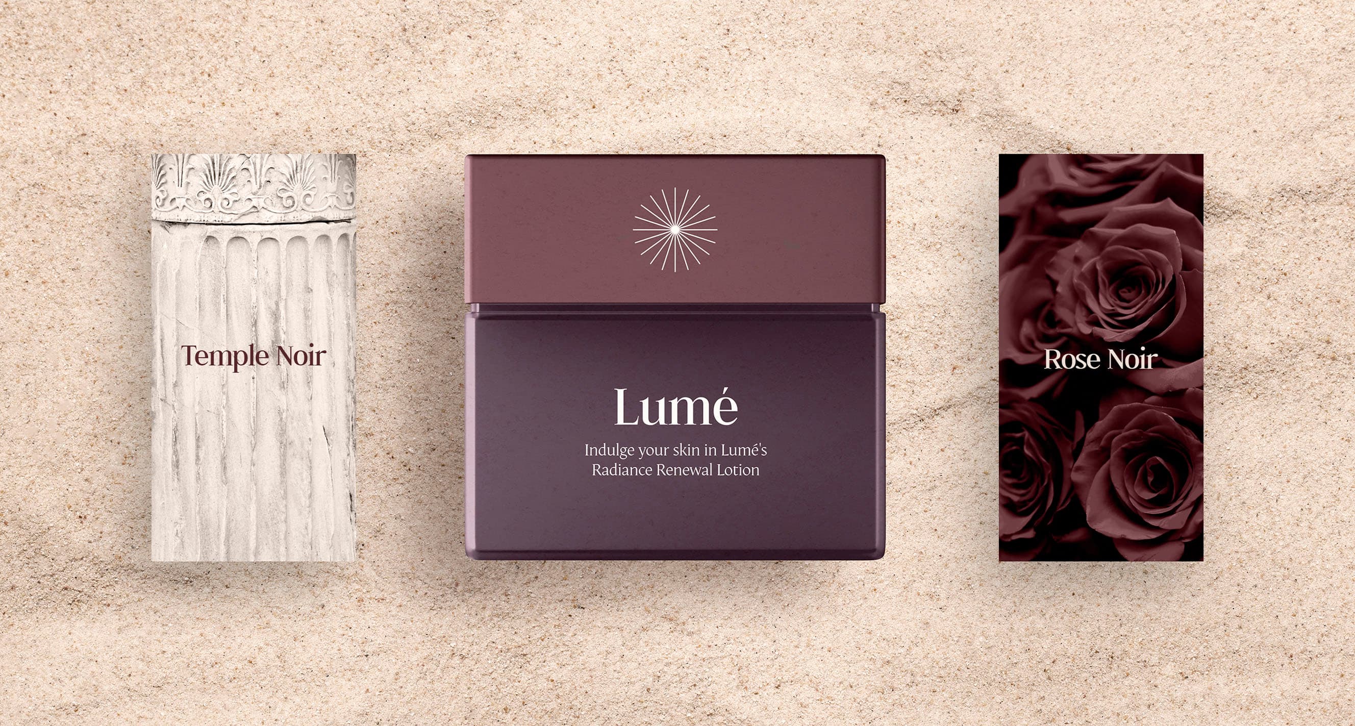
The starting point
A point of view, no brand to carry it.
Lumé Skincare is a dermatologist-developed line, made in Athens – the city that has defined beauty for two thousand years. The product had a point of view: clean ingredients, Mediterranean light, classical heritage. The brand had none of it yet. No mark, no system, no shelf presence. We built the identity from a blank page.
What we built.
The mark
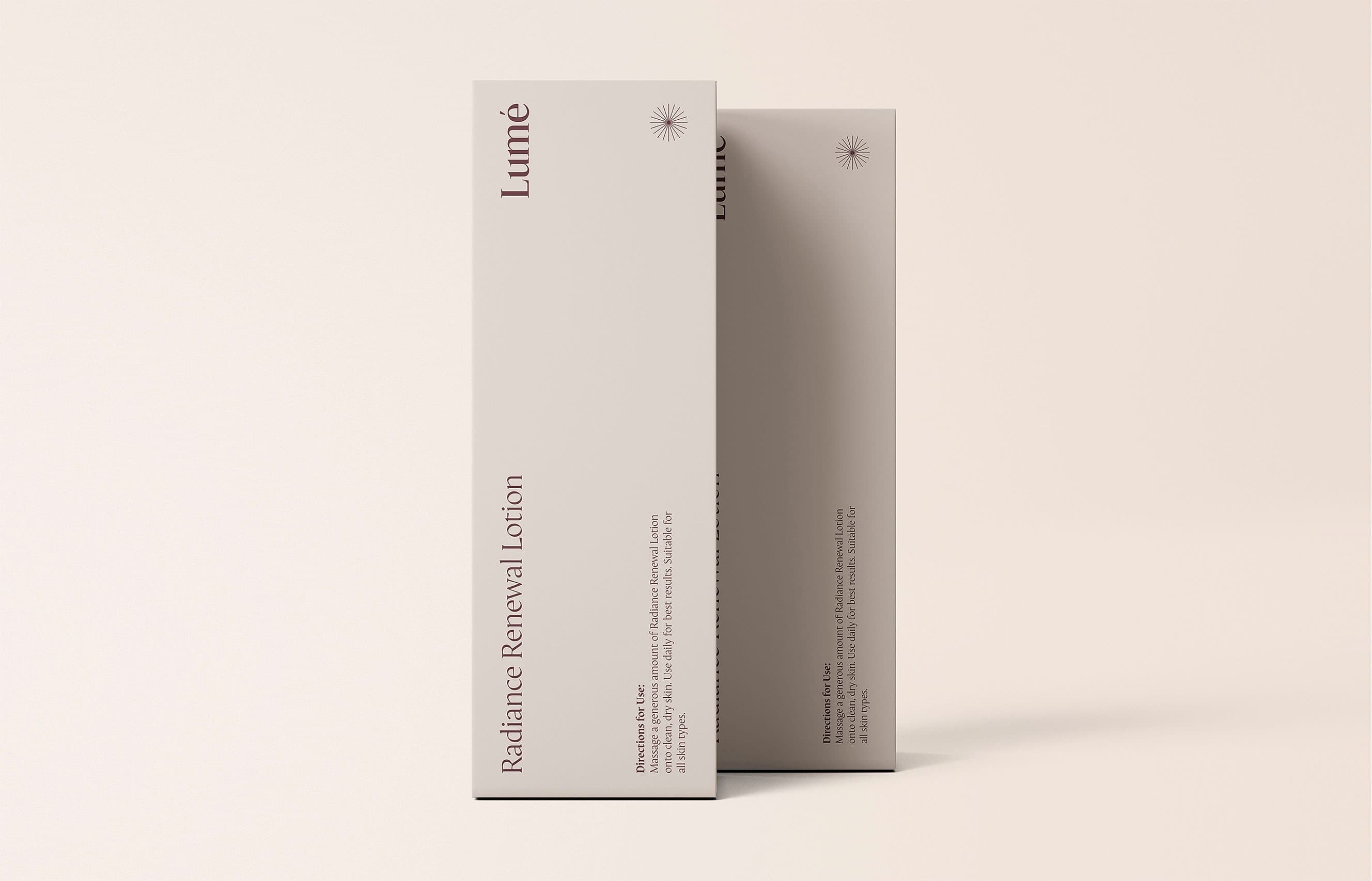
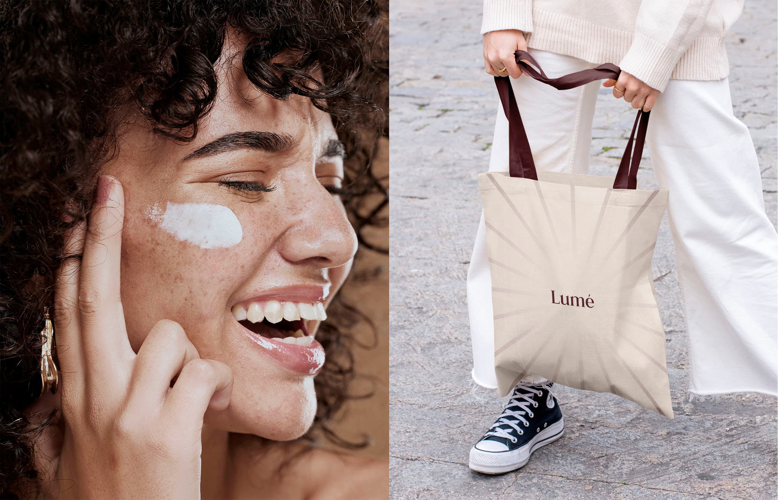
A radiating star, drawn from the name's meaning – light – and the sunburst ornament of classical Greek design. It holds at any size: embossed on a carton, foil on a bottle, a full-bleed pattern across a tote.
The wordmark
A high-contrast serif with an accented é. The letterforms carry the proportion of carved temple inscription, set quiet and sure.
The palette
Two tones. Deep oxblood for weight and depth, warm cream and sand for the marble-and-light side of Athens. Nothing else competes.
Packaging
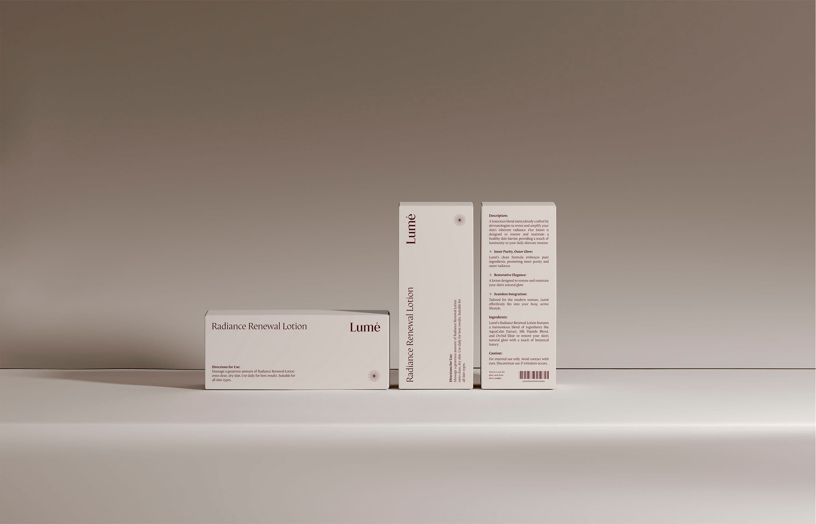
A full system: carton, tube, and airless pump, with a print-ready dieline. The front stays near-silent. The back carries the description, the ingredients, and the directions for use.
Art direction
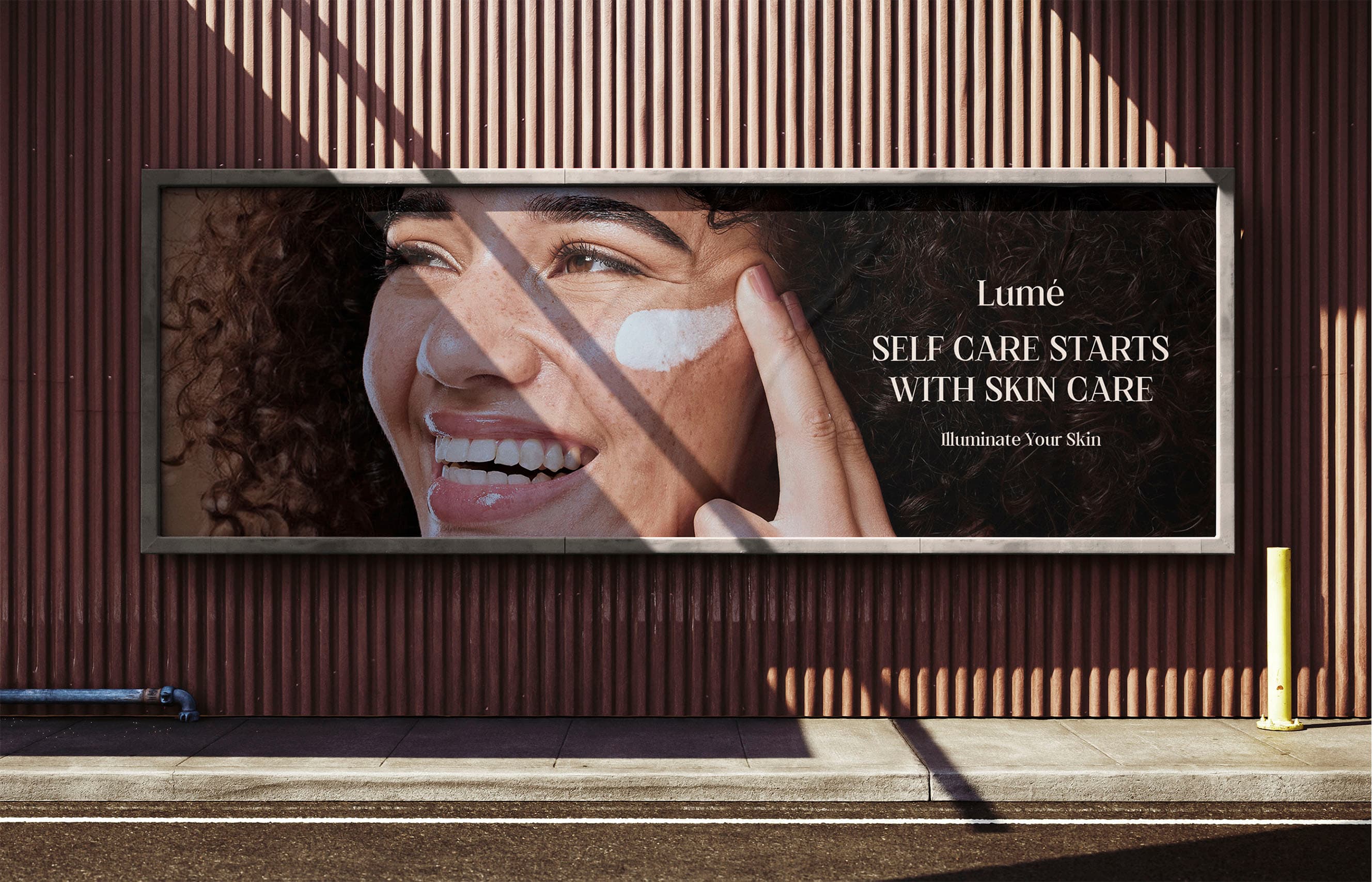
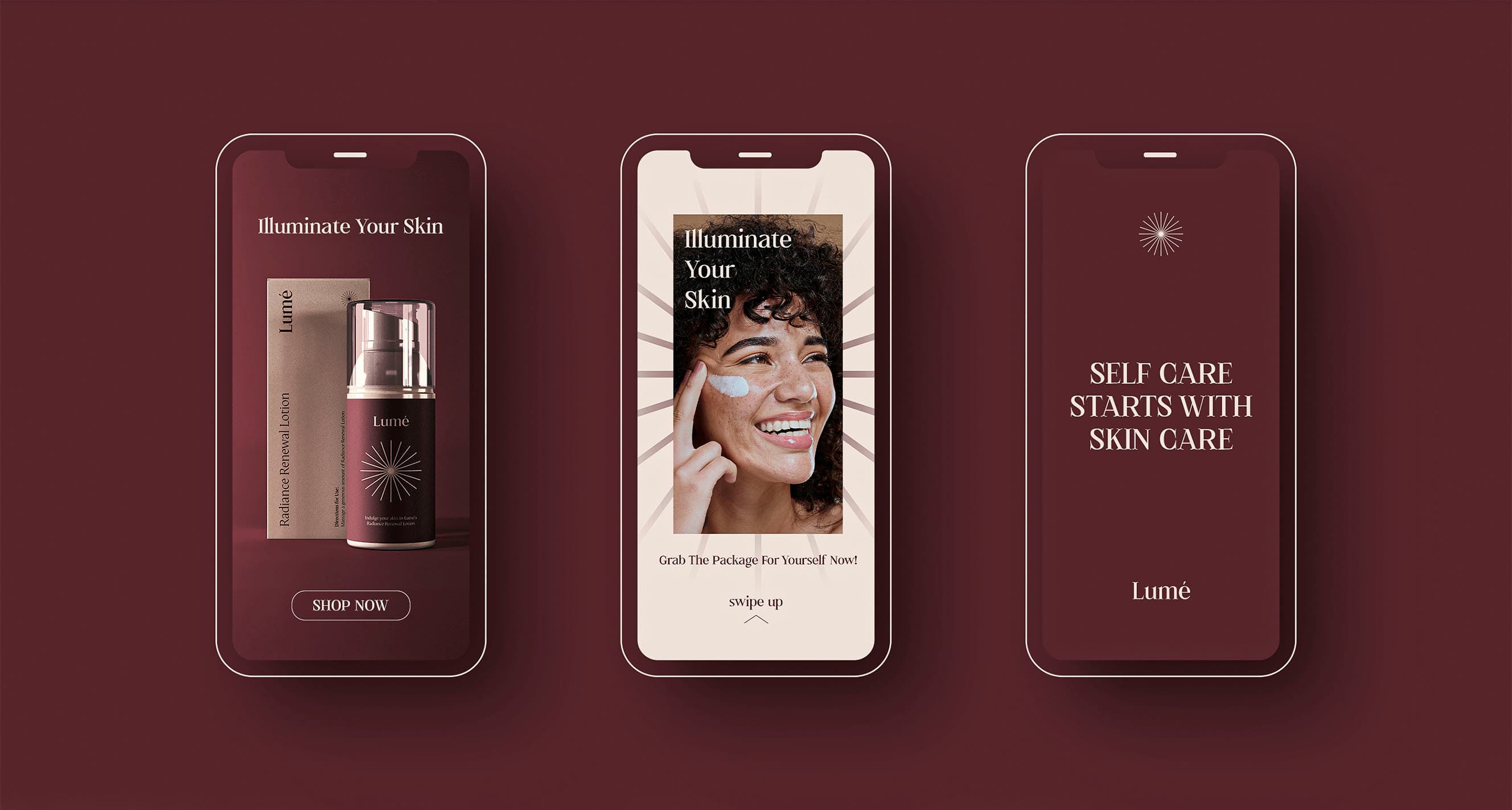
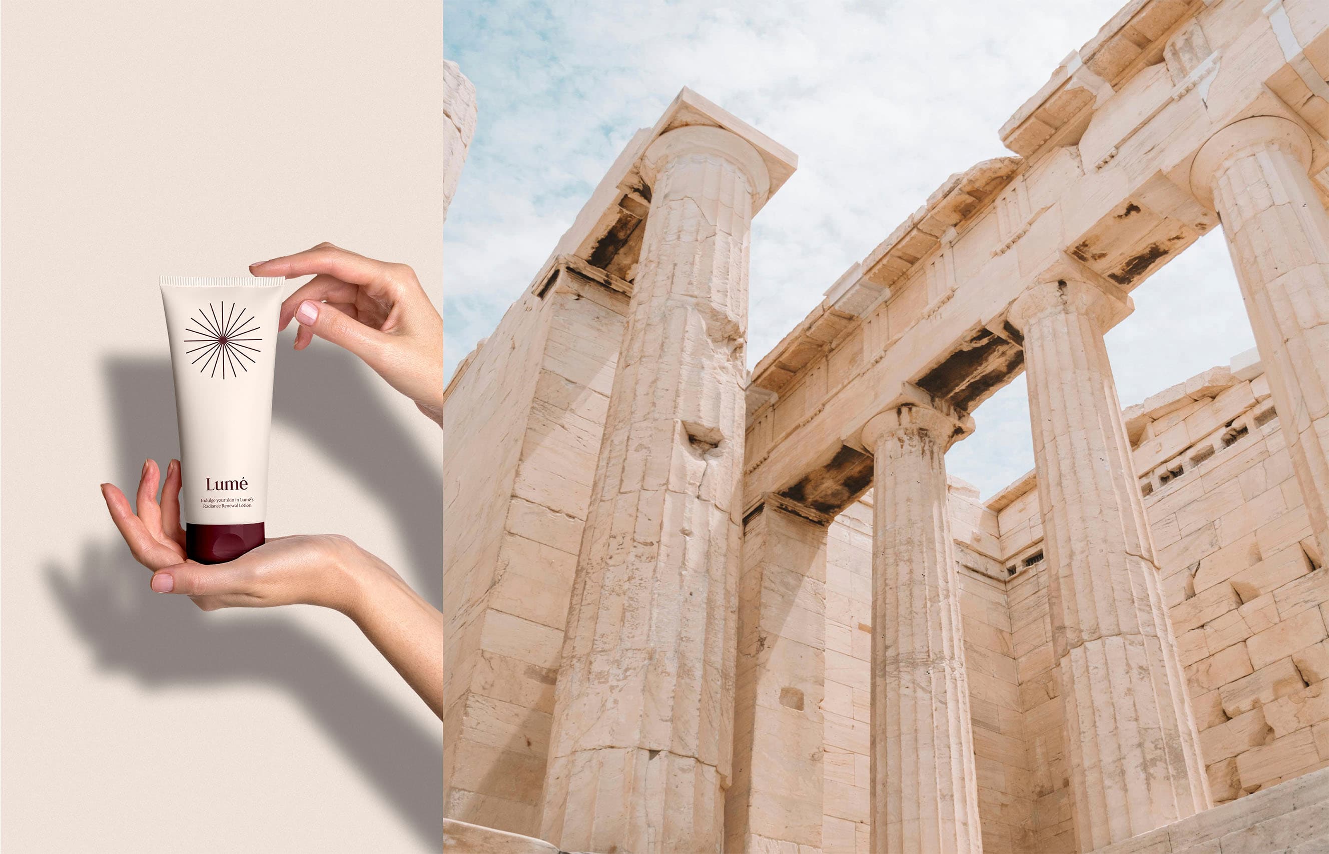
One world across every surface: billboard, social stories, and product photography shot against Athenian marble. Held to a single standard.
Across every surface.
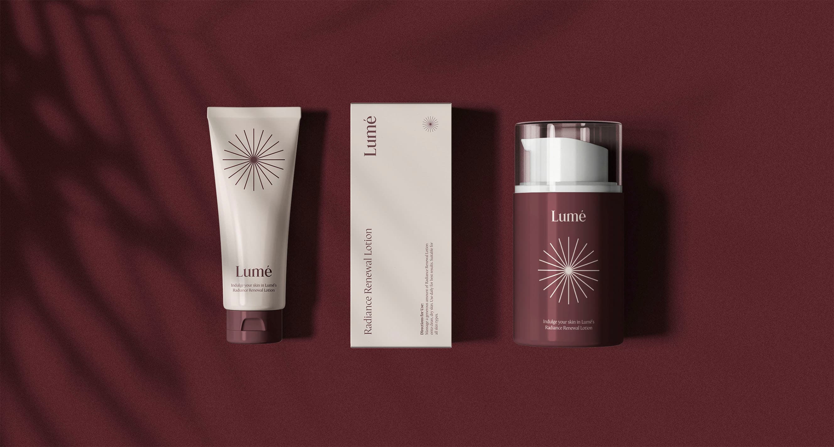
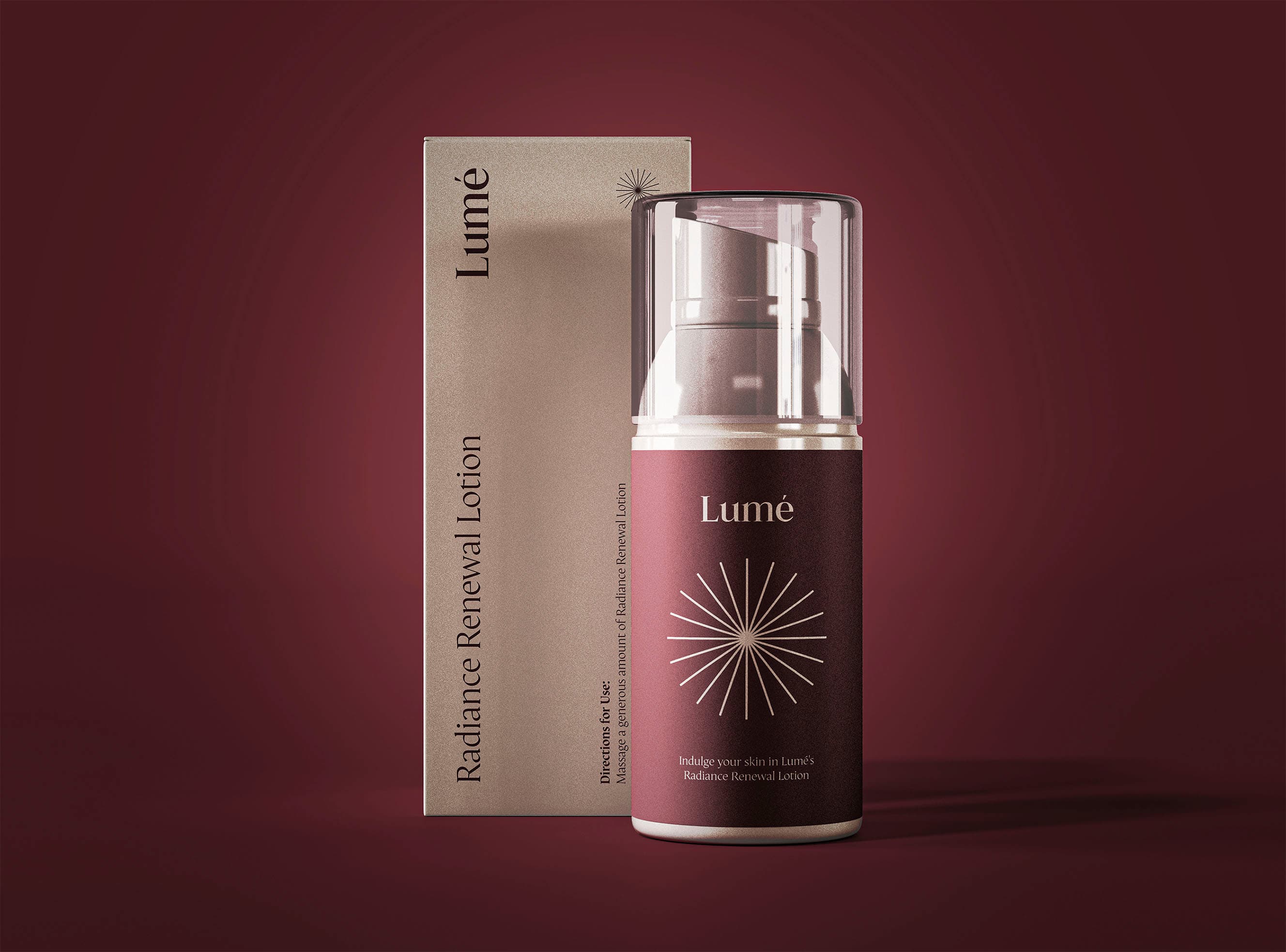
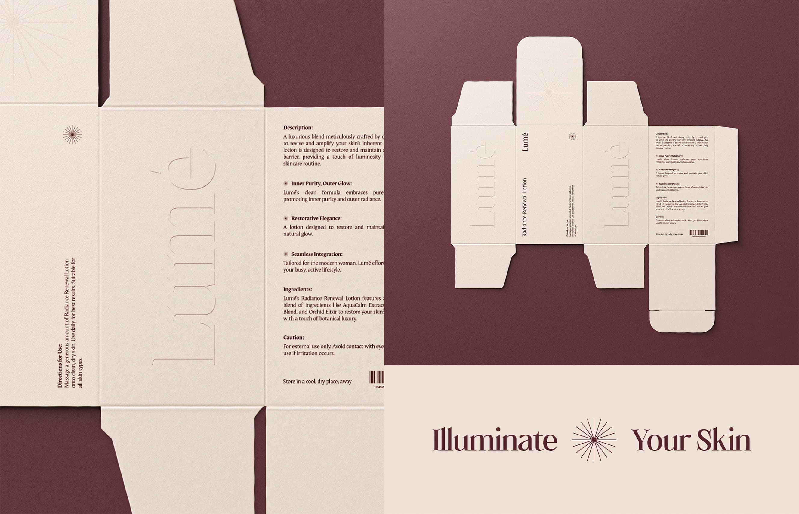
Illuminate Your Skin.Lumé Skincare
Design house
Look like the category leader.
One brief. One specialist. No hand-offs. Tell us what you're building and we'll tell you honestly if we're the right fit.